
Process improvement project - Measure -
Pareto chart
What is it?
It charts frequency.
The more frequently something happens, the more impact it has on an outcome.
It works on an 80/20 rule:
20 = The Vital Few - the most impact, the most important
80 = The Useful (or Trivial) Many - the rest - less likely for wanting to focus
What does it mean when we say “things aren’t distributed evenly?” The point is that each unit of work (or time) doesn’t contribute the same amount.
In a perfect world, every employee would contribute the same amount. Planning would be so easy. But it is not the case. Each employee works at their own pace.

When to Use a Pareto Chart?
-
When analyzing data about the frequency of problems or causes in a process.
-
When there are many problems or causes and you want to focus on the most significant.
-
When analyzing broad causes by looking at their specific components.
-
When communicating with others about your data.
Examples of how Pareto can be applied to Lean Office
-
80% of your sales come from 20% of your customers
-
80% of problems can be attributed to 20% of causes
-
80% of a company's profits come from 20% of its customers
-
80% of a company's complaints come from 20% of its customers
-
80% of a company's profits come from 20% of the time its staff spent
-
80% of a company's revenue comes from 20% of its products
-
80% of a company's sales are made by 20% of its sales staff
-
80% of an employee’s output comes from 20% of their time
-
80% of your problems come from 20% of your employees
How do you read it?
-
It is a bar graph.
-
The length of the bars show frequency or cost.
-
It is arranged with the longest bars on the left, and the shortest on the right.
What can you do with the results?
-
Focus on the most effective areas (20%)
-
Eliminate, ignore, automate, delegate or retrain the rest (80%)
Some important tips and notes
Research indicates that in an office environment, an employee should dedicate themselves for 96 minutes to their most important tasks. During this time, you should avoid multitasking, switch off phone and email. It should be dedicated to your 20% of critical tasks, the 20% that really matter.
Its not only important to Do Things Right, its important that you are Doing The Right Things. Read our Leader Standard Tasks article to learn one way you can do this.
How to create a Pareto Chart?
STEP 1 - Decide what categories you will use to group items.
STEP 2 - Decide what measurement is appropriate. Common measurements are frequency, quantity, cost and time.
STEP 3 - Decide what period of time the Pareto chart will cover: One work cycle? One full day? A week?
STEP 4 - Collect the data, recording the category each time. (Or assemble data that already exists)
STEP 5 - Subtotal the measurements for each category.
STEP 6 - Determine the appropriate scale for the measurements you have collected. The maximum value will be the largest subtotal from step 5. (If you will do optional steps 8 and 9 below, the maximum value will be the sum of all subtotals from step 5.) Mark the scale on the left side of the chart.
STEP 7 - Construct and label bars for each category. Place the tallest at the far left, then the next tallest to its right and so on. If there are many categories with small measurements, they can be grouped as “other.”
STEP 8 - 9 (optional but useful for analysis and communication)
8. Calculate the percentage for each category: the subtotal for that category divided by the total for all categories. Draw a right vertical axis and label it with percentages. Be sure the two scales match: For example, the left measurement that corresponds to one-half should be exactly opposite 50% on the right scale.
9. Calculate and draw cumulative sums: Add the subtotals for the first and second categories, and place a dot above the second bar indicating that sum. To that sum add the subtotal for the third category, and place a dot above the third bar for that new sum. Continue the process for all the bars. Connect the dots, starting at the top of the first bar. The last dot should reach 100 percent on the right scale.
You can also use Excel which includes a Pareto Chart in the Charts tab (Statistic Chart - Histogram - Pareto).
Pareto Chart Examples
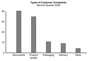
Example #1 (left chart)
It shows how many customer complaints were received in each of five categories.
If all complaints cause equal distress to a customer, working on eliminating document-related complaints would have the most impact.
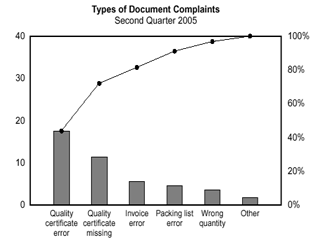
Example #2 (right chart)
This pareto chart takes the largest category, “documents,” from Example #1.
It breaks down the Document category into six subcategories and shows cumulative values. Of the sub categories, working on quality certificates should be most fruitful.
What Is my key takeaway?
The point of the Pareto principle is to recognize that most things in life are not distributed evenly.
Instead of spending 1 hour drafting a report you’re not sure is needed, spend 10 minutes thinking of solutions. Then spend 50 minutes writing about your best solution
Instead of spending 3 hours on a single PowerPoint design, make 6 layouts (30 minutes each) and choose your favorite.
Instead of spending 3 hours to read 3 articles in depth, spend 5 minutes glancing through 12 articles (1 hour) and then spend an hour each on the two best ones (2 hours)
The point is to realize you have the option to focus on the important 20%.
When you are seeking top quality, you need all 100%. When you are trying to optimize your time vs cost, focusing on the critical 20% is a time-saver. See what activities generate the most results and give them your appropriate attention
CAN'T FIND WHAT YOU ARE LOOKING FOR? CONTACT US HERE
